Showing posts with label studio work. Show all posts

Monday, 11 November 2013

Old Self Portrait Post, Current Study

Was running waaay behind schedule with some coursework-related deadlines, so unable to do anything for the self-portrait day on nov the 1st.

As a compromise, here's a small study done in the old studio late summer:


And below is a study done at Battersea power station grounds (of two loading cranes) when it was briefly open to the public prior to redevelopment:


Tuesday, 13 August 2013

Studio Clearout

Some older portraiture studies done in the studio over the past year, prior to moving out over the summer.The next few posts after these will mainly be newer landscape work, waiting for paint to dry on the landscape panels!


Drawing study of my younger brother, preparatory work for a future painting project.


Study of Leyne


Small poster study of my youngest brother- this study was done quite a while ago, almost 2 years ago


Tania, first state


Vivi, first state

Tuesday, 25 June 2013

Coursework Shows and Recent Studio Things...

Apologies for the long delay in between posts, been busy lately with coursework-related projects in campus, and with a pretty hectic moving schedule over the summer break. Had a bit of downtime lately, so will catch up with showing recent events and things happening.


(above) Shots from a recent MA interim show that we were a part of in London, the space was absolutely massive as seen from the pictures above. Pretty intimidating space to fill with work...

(third image down) My small contribution for the MA Art & Science course- a series of inked etching plates of anatomy studies done at the Gordon Museum, King's College, London (more to follow in later posts about this particular project!)


(above) This tiny study made it in to the recent Royal Society of Portrait Painters Annual Show in the Mall Galleries in London. Sadly didn't manage to get a photo of the panel with the frame, turned out pretty nice


Studio in progress.

Tuesday, 29 January 2013

Sketchbook drawings and paintings, round 3


A bit of painting & drawing studies for the new year!

Several poster studies from a while back & Boldini/Velazquez study

Saturday, 17 November 2012

Sketchbook Drawings and Paintings, Round 2


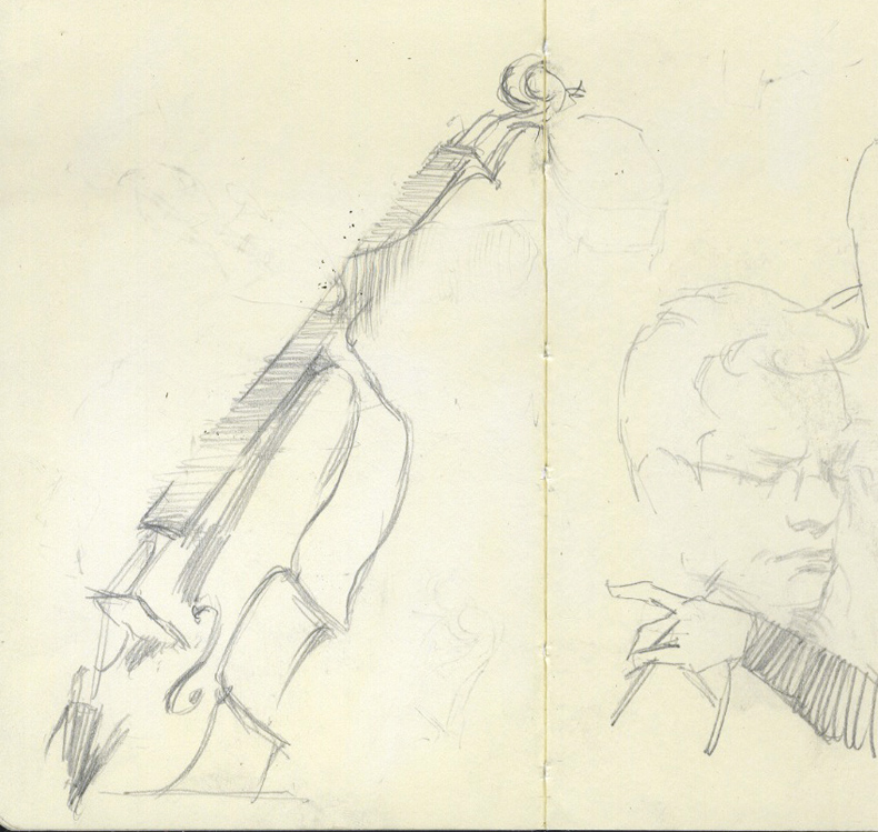
More sketches and figure drawings. Trying out certain approaches towards construction in figure drawing, i.e. 'less blocky', going for identifying sweeping, gestural statements and then narrowing down to key anatomical aspects. Some orchestral sketches to add to the mix as well.


Finished charcoal drawing for the painting re-try.


Thursday, 23 August 2012

Poster Studies


A 'poster study', or a quick, small-scale mass sketch is helpful to solve issues in getting the visual impression from a particular composition, scene, pose, etc. It's meant to be the broadest and simplest possible expression of what you see, but also must contain some basic information that you could use in aid of the actual work itself. 

Time taken ideally for a poster study or sketch? Depends, really on what you want to achieve. Most of these were done in various drop-in evening classes, sketching sessions, life drawing sessions, from photographs, etc etc etc. usually when working in mass is more preferable than linework. They usually stop short at the 'block-in' stage, right before attempting to correct/amend drawing and considering edges. It's quite fun doing poster studies, and a goal once set by a tutor was to attempt 50 successful poster studies in the course of a single year to force yourself to think in much broader, simpler terms in mass expression. 


Procedure was like zapping solid blocks of mass in place until the overall impression is reached at, or the entirety of the support is covered. The compromise between accuracy of drawing and the overall vision as defined by the restrictive time limit is something that has to be learnt as well- the broader the overall vision, generally the more accomplished the draftsmanship involved.


Thursday, 16 August 2012

Sketches and non-paintings


Something not paint-related... some scans of old and some new-ish sketchbook drawings, a mix of different things, just looser and more gestural work in pencils and some older pen drawings. 


The double studies in charcoal are initial stages in the drawing meant for a painting project started a year ago... having to refine the drawing and with a greater sensitivity for draftsmanship this time round, I felt that the end result this time round will be much better than the first attempt at the painting.

Friday, 1 June 2012

The Hue Shift Bit, Part II


The real deal. Full pigment range, from left on the top most chart: Cad. Lemon, Cad. Yellow, Cad. Yellow Deep, Yellow Ochre Pale, Cad. Red, Terra Rosa, Alizarin, Trans. Oxide Red, Viridian, Cobalt Blue, Ultramarine Blue Deep. Things I missed out (or should've tried out): Cobalt Violet (in place of one of the warm yellows), Quinacridone Rose (instead of Alizarin), maybe branch out into oranges and darker blues like Prussian Blue or some Phthalo-containing blues and greens. This would push it closer towards a pallette approximating Sorolla's. Also, the red-oranges can be consolidated somewhat by using Burnt Sienna instead of the Red Oxide and Terra Rosa (but then again, I will lose the transparent quality of the Red Oxide).

In a way, doing these charts mean that you have to be very disciplined and rigorous with yourself. Clean everything and anything on the palette that could and would stain the mixtures, and always be sure what you are putting on to the chart squares at all times (that bluish green you see there? It's never going to be specific enough- just make sure that one batch leans towards blue, the other leans towards green, it has to be subtle but observable).

I guess the main lesson is to understand your palette of choice, and the nature of the pigments that you are using- here, student paints vs. artist quality (of differing brands) really shows in terms of the handling, tinting strength, and overall vibrancy. Some people will stumble across these same points through constant painting, which is entirely valid as well- the point is not to let these exercises dominate the fundamental skillsets of drawing and painting- they are means to an end, not something you do for 'Achievement Unlocked' street cred. 

'Colour' is technically relative to the lighting situation and even on the support you are using, there will be different factors and permutations affecting the 'local colour'- it's the understanding of subtractive mixing, temperatures of pigments and their mixtures, that is the key to this specific type of exercise. You will encounter the legendary Cadmium Salute and the Viridian Handshake (just don't wear any new clothing in the studio, it'll end in tears), and there will be foul language employed. But at the end of the day, the understanding you'll get will be somewhat worth it. And it will be seen that these colour chart exercises are easy- compare them with, oh, the Munsell colour chip matching exercise. Now that's in a completely different league altogether.

Tuesday, 8 May 2012

The Hue Shift Bit, Part I


These are a series of limited palette colour charts done at the start of the year- they are a simplified version of the legendary Richard Schmid colour mixing exercise. It's a relatively simple means of understanding your pigments- in this case, the charts are meant for figurative and portraiture painting in the studio. Also, I get to learn a lot more about specific characteristics of some of the paints currently floating about in my studio. Gotta do them while I still am young and reckless enough to have free time, I suppose ;)

First chart shows all the colours used in the limited palette- the subsequent charts are each column from the top-most chart (pure colours on the left-most sides of each subsequent charts) mixed with the other colours from the limited set (so the top row on the second chart is Yellow Ochre, then yellow ochre + Cadmium Red, Yellow Ochre + Burnt Sienna, etc all lightened down with white). Colours used are (from left) Yellow Ochre, Cadmium Red, Burnt Sienna, Terra Verte, Cobalt Blue, and Mars Black.

Several observations:

  1. Yellow Ochre, or more specifically, the variety that I was using, was too brickish and low value (so by default I cannot get relatively chromatic greens and oranges, even when mixed with Cadmium Red). The remedy to this would be to replace the ochre with a lighter value equivalent, or to use an earth colour like Mars Yellow, giving slightly richer secondaries.
  2. Using a limited set or palette of convenience means that it's more difficult to get vibrant mixtures. You don't have the luxury of selecting a warm/cool set for each colour (something like Cad. Red/Crimson Alizarin, Lemon Yellow/Cad. Yellow Deep, Cobalt Blue/Phthalo Blue Deep), so the pigments you have should be of the highest quality and specific to the task at hand. The Munsell Student Colour Book is pretty helpful in this regard, there's a chapter on practical pigments for successful colour mixing.
  3. Drying times- cadmiums take a relatively long time to dry compared with the earth pigments, so there might be problems with a figure painting pose that is to be continued the day after (you will inevitably smudge the support when oiling it at the start of a new session the next day), so substituting it with a similar red, like Pyrrole-based reds (comparatively faster drying with the same relative chroma, and cheap!), much like using Mars Black instead of Ivory Black. Then again, you can just mix a bit of drying oil or Liquin into your white paint or red mixture (or use lead white instead).

With something as technical as this, it's pretty easy to get caught up with specifics, and mechanically finishing off these charts as part of a 'to do' list. It's no shortcut to becoming a colour boss, but it'll greatly help it if you've got some sort of reference lying about in the studio environment- would be quite handy in the long run and you get to understand the specifics of the pigments you are using. Cuts the time wasted trying paints when painting out in the field. Know your materials!

Will definitely revisit these colour charts several years from now with these points in mind. There's more practical things to do in the meantime (like, actually starting to draw and paint).